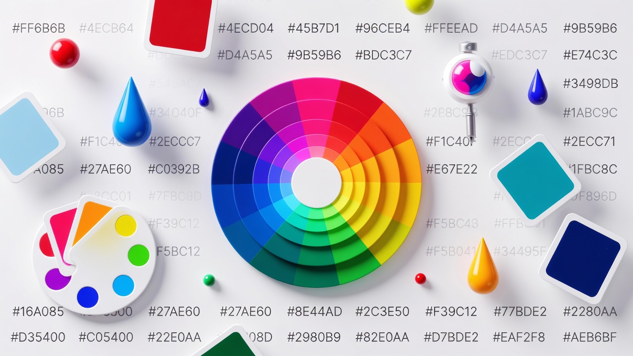
Have you ever been completely captivated by a stunning website’s color scheme, or felt a brand’s colors just *click* in your mind? That’s no accident. Color is the silent storyteller of design, shaping emotion, guiding attention, and building identity in an instant. But for designers and developers, finding that perfect shade—and making it work across a whole project—can be a real challenge. This is where a powerful, free color picker online becomes your creative sidekick. It’s more than just a tool to grab a hex code; it’s your gateway to confident, harmonious, and accessible color choices. Let’s explore how to use this essential tool to bring your visual ideas to life.
What is a Color Picker Tool?
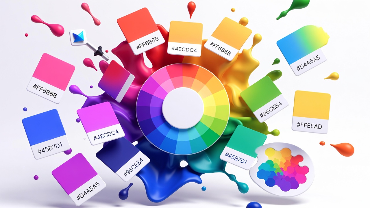
At its simplest, a color picker tool is a digital utility that allows you to select, identify, and manipulate colors. Think of it as a high-tech, infinitely precise paint swatch book. The most common form is an HTML color picker built into design software or available as a standalone web tool. It typically presents a color spectrum or wheel, sliders for adjustments, and displays the color’s values in multiple formats like HEX, RGB, and HSL. Whether you’re tweaking a button’s hover state in CSS, matching a brand color from a competitor’s logo, or building a cohesive color palette from scratch, this tool is your foundational instrument.
How to Use an Online Color Picker: A Beginner's Walkthrough
Using a modern color picker online is intuitive. Here’s a breakdown of the typical workflow you’ll encounter:
Step 1: Access the Tool and Choose Your Method
Open your chosen tool in your browser. You’ll usually have two primary ways to pick colors:
- The Spectrum Selector: Click or drag your cursor across a visual gradient (a square or wheel) to choose a base hue and saturation.
- The Eyedropper (Picker): The magical tool! Activate the eyedropper, then move your cursor anywhere on your screen—even outside the browser window—to sample a live color from an image, website, or video.
Step 2: Fine-Tune with Sliders and Values
Once you have a base color, use sliders to adjust properties like Hue, Saturation, Lightness (in HSL), or Red, Green, Blue channels (in RGB). You can also directly type values into fields if you know the exact HEX code or RGB values you’re aiming for.
Step 3: Copy and Use Your Color Code
The tool will display your selected color in all common formats. Click the copy button next to the value you need (e.g., #FF5733 for CSS colors) and paste it directly into your design software, code editor, or style guide. It’s that simple!
Real-World Example: Let's say you sampled a beautiful coral from an image. Your color picker might show it as:
HEX: #FF5733
RGB: rgb(255, 87, 51)
HSL: hsl(11, 100%, 60%)
You now have the exact code to recreate that color anywhere.
Decoding Color Formats: HEX, RGB, HSL, and More
Why are there so many ways to write the same color? Each format has its superpower, and understanding them makes you a more versatile creator.
HEX (Hexadecimal)
The standard for web design. A HEX code is a 6-digit combination of numbers and letters (0-9, A-F) prefixed with a hash (#). It represents the red, green, and blue (RGB) components in a compact, code-friendly way. Example: #4287f5 is a nice blue.
RGB (Red, Green, Blue)
This format defines a color by how much red, green, and blue light it contains, each on a scale from 0 to 255. It’s intuitive and often includes an alpha channel for opacity (RGBA). Example: rgba(66, 135, 245, 0.8) is that same blue at 80% opacity.
HSL (Hue, Saturation, Lightness)
This is a designer’s best friend for creating color schemes. Instead of mixing light, it describes colors in a way that aligns with human perception:
- Hue: The actual color (0-360 degrees on a color wheel).
- Saturation: The intensity (0% is gray, 100% is full vibrancy).
- Lightness: How light or dark it is (0% is black, 100% is white).
Adjusting the Lightness slider in an online color picker is the easiest way to create perfect tints and shades.Color Theory Basics: The Shortcut to Harmony
A great color picker does more than isolate colors; it helps you build relationships between them. Here’s a quick primer on classic color schemes you can generate with advanced tools:
- Monochromatic: Different shades, tints, and tones of a single base hue. Elegant and foolproof.
- Analogous: Colors that sit next to each other on the color wheel (e.g., blue, blue-green, green). Creates serene, comfortable designs.
- Complementary: Colors directly opposite on the wheel (e.g., orange and blue). High contrast and vibrant—perfect for calls to action.
- Triadic: Three colors evenly spaced around the wheel. Offers rich visual interest while retaining balance.
Creating Professional Color Palettes and Schemes
Moving from one perfect color to a full palette is the mark of a pro. Use your color picker online to:
- Start with a Base: Pick your primary brand or key color using the eyedropper or spectrum.
- Generate a Scheme: Use the tool’s built-in generator to create complementary, triadic, or other harmonious colors based on your base.
- Expand with Shades and Tints: For each color in your scheme, use the Lightness slider to create a lighter tint (for backgrounds) and a darker shade (for text). This builds a flexible, cohesive system.
- Test in Context: Many tools let you preview your palette on a mock website or UI template. See how your colors feel in a real layout.
The Non-Negotiable: Accessibility and Color Contrast
Beautiful colors are useless if people can’t see them. Inclusive design is mandatory, and your color selector tool should be your ally. Always check the contrast ratio between your text and background colors. The Web Content Accessibility Guidelines (WCAG) require a minimum ratio (typically 4.5:1 for normal text) to ensure readability for users with visual impairments.
Modern online pickers often include a contrast checker. Simply input your foreground and background colors, and the tool will instantly tell you if the pair passes AA or AAA standards. This isn’t just good ethics—it’s good UI design and expands your audience.
Frequently Asked Questions (FAQ)
Is it legal to pick colors from any website or logo?
While the color itself is not copyrightable, a specific combination of colors used in a trademarked context (like Coca-Cola red) can be protected. Using an HTML color picker to get inspiration or understand color relationships is fine. Directly copying a competitor’s exact palette for your own brand identity, however, is not advisable and could lead to legal issues.
What's the difference between a color picker and a color palette generator?
A color picker is for selecting and identifying individual colors. A palette generator uses algorithms (often starting from a color you pick) to create a harmonious set of 4-6 colors for a complete scheme. Many online tools combine both functionalities.
Why does my color look different on another screen?
Screen calibration, display technology (OLED vs. LCD), and brightness settings vary wildly. A color managed by professional design software will be more consistent. For web, always test on multiple devices. Rely on contrast ratios to ensure legibility despite screen differences.
How do I pick a color from an image on my computer?
Most online tools require you to upload the image into their interface. Some desktop applications (like Photoshop, Snipping Tool on Windows, or Preview on Mac) have built-in pickers that let you sample colors from any image file open on your system.
Can I create a gradient with an online color picker?
Absolutely! Advanced tools feature a gradient builder. You can pick your start and end colors (and add stops in between), adjust the angle, and get the CSS code for linear-gradient() instantly. It’s a fantastic way to add depth with minimal effort.
Color is a language, and a color picker online is your translator. It bridges the gap between inspiration and execution, between a feeling in your gut and a precise code in your project. By mastering this tool—understanding formats, leveraging theory, and prioritizing accessibility—you empower yourself to make deliberate, impactful visual decisions. So go ahead, play with that spectrum, experiment with the eyedropper, and build something not just colorful, but meaningful.